The Poster Art of Sister Mary Corita Kent


In the 1960s and '70s the word "artist" came loaded with certain assumptions -- typically male, brazen, and living in New York. Pop artist Corita Kent was none of those things. Like her contemporary (and later influencer) Andy Warhol, she heavily referenced images from pop culture. She also worked mainly in silkscreen printing. But the similarities seem to end there.
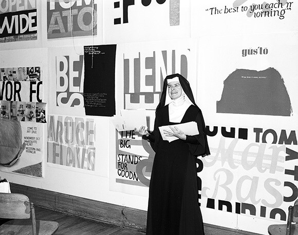
Corita Kent was a Catholic nun with the order of the Sisters of the Immaculate Heart of Mary in L.A. Born Frances Elizabeth Corita Kent in 1918 in Fort Dodge, Iowa, she grew up in Los Angeles. Sister Mary Corita, as she was known, entered the order in 1936, taking art classes at Otis College and Chouinard Art Institute (which eventually became CalArts), she earned a BA in art from Immaculate Heart College.
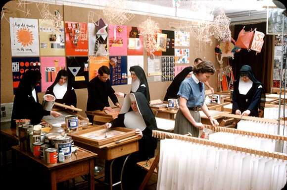
In 1947, the order invited Sister Kent to return from a teaching position in British Columbia to teach part-time in the art department while she pursued an MA in art history at USC. Kent taught at IHC until 1968, named chair of the art department in 1964. Under her leadership, this small, Catholic women's college became a hub for creatives, bringing guests such as designers Ray and Charles Eames, architect Buckminster Fuller, writer Henry Miller and composer John Cage.


It was while she was studying at USC a decade later that Kent was introduced to serigraphy, the printmaking medium she experimented in for the next three decades. Like her most famous fellow silkscreen enthusiast, Andy Warhol, Kent borrowed heavily from advertising and signage in her prints. And like her contemporaries, Kent subverted the meaning of popular slogans to serve her own mission. A visit to Andy Warhol's landmark show at L.A.'s Ferus Gallery in 1962 further drove Kent towards appropriating the language, colors, and aesthetics of commercial design in her work.
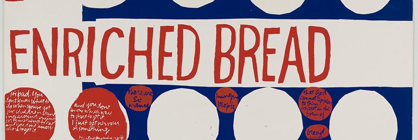
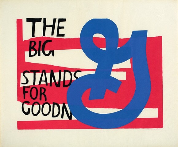
Her bright, vibrantly colored prints borrowed ad slogans from companies like Del Monte ("Makes Meatballs Sing") and Kellogg's ("The best to you each morning"), Yet rather than embrace the mocking detachment or cynical irony found in the works of artists like Warhol and Ed Ruscha, Kent transposed commercial slogans with her own brand of idealism. In her hands, General Mills' tagline "The big G stands for goodness" was transformed from corporate hyperbole to reverent devotional. The package design for Wonder Bread became a indictment of hunger and privation.
She was also a social activist, agitating for civil rights and an end to the Vietnam War. Her proclivity for political and spiritual messages in her work inspired not just generations of her students but landed her on the cover of Newsweek in 1967 with the headline "The Nun: Going Modern."


The freewheeling, stylized text used in the more than 800 works made during her lifetime borrow not just from advertising but magazine articles, urban signage, quotes from writers such as Gertuide Stein and Samuel Beckett, and lyrics from popular songs by the Beatles, the Doors, and Paul Simon.
Kent developed pre-Photoshop techniques that allowed her to create curved and mutated images using stencils and photographs. Her techniques derived from collage but the rotated and twisted text attains a sculptural quality.
Kent's aim was to make her work as democratic as possible. "It's why screenprinting was her medium of choice," says Ray Smith director at the Corita Art Center in Los Feliz. "She wanted her work to be low priced and accessible. It was everywhere."
As a teacher, she also wanted her students to be inspired by the urban iconography of Los Angeles. She took them on field trips to explore local car dealerships, markets, and the streets of Hollywood. She encouraged her students to experience these tableaux through fresh eyes with the use of an empty 35mm slide mount that students could use to frame images.


While she primarily considered herself an artist and her work was shown at the Metropolitan Museum of Art, LACMA, and MoMA, she also accepted design commissions for magazine and book covers, album sleeves, and posters. The "Love" stamp she designed for the United States Postal Service sold more than 700 million copies. In 1966 she participated in more than 150 exhibitions in galleries, museums, and universities. It was her prodigious output and talent that prompted The Los Angeles Times to name her its "Woman of the Year" that year.
By 1968 Sister Kent left the order and Los Angeles to relocate to Boston, where she continued to focus on her art. A drawn out battle to broaden the scope of the Church's community service resulted in a definitive rejection of reform by the Cardinal. Kent took a sabbatical and traveled to Cape Cod. After leaving the Church and teaching, Kent's work shifted towards more personal and introspective work. After a protracted battle with cancer, Kent died in 1986.
Yet despite her prolific output and indefatigable work ethic (exacerbated by insomnia), Kent became more of a cult figure in the art world than a household name. A new exhibition aims to reclaim Kent's legacy and rightful place in the art historical canon. "Someday is Now: The Art of Corita Kent" opened Sunday at the Pasadena Museum of California Art. Smith attributes the renewed interest in the nun's legacy as part of a larger movement in Los Angeles to understand its own history: "L.A. is investigating its creative roots. There's more awareness of its biases."


Dig this story? Sign up for our newsletter to get unique arts & culture stories and videos from across Southern California in your inbox. Also, follow Artbound on Facebook, Twitter, and Youtube.


