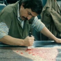
The Hammer's '600-image Teaser' of Sister Mary Corita Kent's Powerful Work


A nun, an activist and a prolific artist, Sister Mary Corita Kent wasn’t your run-of-the-mill Sister of the Immaculate Heart of Mary. In the 60s and 70s, Kent elevated screen printing, “a sign painter’s lowly tool,” into a respected art form. Like Andy Warhol, Kent found inspiration in advertisements. But rather than taking a cynical view of these obviously commercial messages, she recast these ads in bold color, transposed them and layered them with poignant messages borrowed from the likes of Gertrude Stein and the Beatles. Her provocative messages, which commented on war and hunger, made their way into magazines and book covers. While teaching at the Immaculate Heart College, she inspired a generation of young women and turned her class into an unlikely hotbed of creativity, creative greats such as Charles and Ray Eames, Buckminster Fuller and Alfred Hitchcock all walked through the school’s halls.
Kent was a prolific artist, creating over 800 serigraphs, thousands of watercolors, plus more public and private commissions in her lifetime. After her death, she bequeathed her personal art collection of more than 1,400 artifacts to the UCLA Grunwald Center for Graphic Arts at the Hammer Museum. “When she died in 1986 and left [her collection] to us, it was a surprise,” says Cynthia Burlingham, director of the Center, “but I believe that she wanted the collection to be at a museum at a major university where it could be available to students and faculty.”
“She made almost 800 screen prints, and we have examples of virtually every print, some produced in different variations,” added Burlingham. Drawings, maquettes and notes to her printer are also included in the collection. The truly intrepid can actually contact the Hammer to come sit with a box of Corita Kent prints without a glass barrier between you and her work. But if you’re hampered by time or distance, the Center has recently unveiled an expanded digital collection with more than 600 works available online. Not only does it include the final works, but also preparatory materials that bears “her instructions, her musings, her choices, her debates, things that ended up in the final image.”
Artbound asked Burlingham to take us through some key pieces in what she calls the “600-image teaser” of Kent’s work. When viewed together, this selection shows the evolution of this dynamic artist.
the lord is with thee, 1952

Kent created this piece early on in her career, when she still looked to religion for her primary inspiration. It features heavy lines, compartmentalized shapes, saints and virgins. “This print shows the influence of traditional religious art on her early work, such as stained glass windows in Gothic cathedrals,” says Burlingham.
christ and mary, 1954
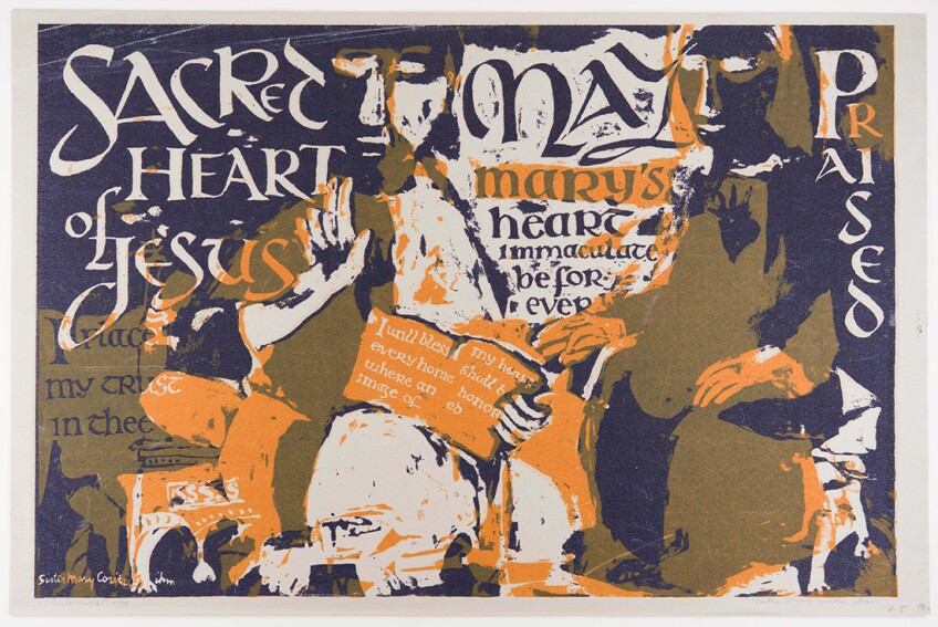
Kent continues to work with Christian iconography in this piece, but starts to experiment with words and images.
all the nations shall come, 1955

“This is an important example of a very complex and ambitious early Corita print,” says Burlingham. Until the 60s, screenprinting was just seen as a commercial medium. Kent appropriated screenprinting in her work, often collaborating with her students at Immaculate Heart. This elaborate piece adopts an expressionistic style, according to Burlingham.
“It’s very painterly and evocative,” says Burlingham, “She probably used twenty colors in this print. And if you consider that she had to apply each color one at a time, layer by layer, then you can appreciate the technical complexities involved in making this work.”
as a witness to the light for john 23 and j.f.k., 1964
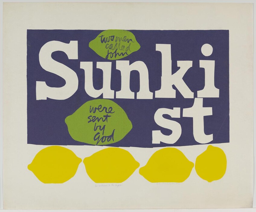
Kent often used advertising as a source for her images. In this piece, she calls to mind two men called John, referring to John the Baptism and JFK, who was assassinated just a year before. “Her message her is very politically charged, but still very much based on her faith,” says Burlingham.
for eleanor, 1964

In her classes, Kent often had students go out of the school’s confines, on the streets and inside markets, looking for inspiration. Here, Kent takes the well-known General Mills logo and turns it on its end, re-relating its imagery instead for another big G.
mary does laugh, 1964
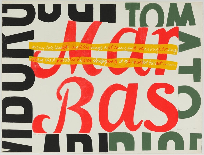
“During this period, she became very much an activist, focusing on major issues such as world hunger and the important role of food in world peace,” says Burlingham. “There’s a lot of food-related imagery in the work of this period, much of it inspired by products found in the new Market Basket across the street from the silkscreen studio at Immaculate Heart.”
that they may have life, 1964

Kent did a number of prints based on Wonder Bread, including this one, which incorporates words from Gandhi. The collection even includes a photo she took of a Wonder Bread billboard. “She’s appropriating design elements from the packaging of this bland bread and evoking Eucharist wafers,” says Burlingham, “Remember that this is 1964, in the middle of the Pop Art movement, and artists like Jasper Johns and Robert Rauschenberg are also appropriating commercial advertising imagery. You can tell that she really was very much part of the art world of her time.”
now you can, 1966

Kent created a proto Photoshop process, even before the tool even existed. “You can see how text in this piece curves around,” points Burlingham. Kent would get imagery and text from magazines, manually manipulate them and then take photographs of it to be used for her screenprinting.
stop the bombing, 1967

Another example of her proto Photoshop process, this time commenting on the Vietnam War.
Untitled [preparatory material for phil and dan], 1968
![Untitled [preparatory material for phil and dan], 1968 | Collection UCLA Grunwald Center for the Graphic Arts, Hammer Museum. Corita Kent Bequest.](https://kcet.brightspotcdn.com/dims4/default/6dbaa3c/2147483647/strip/true/crop/1100x843+0+0/resize/848x650!/quality/90/?url=http%3A%2F%2Fkcet-brightspot.s3.us-east-1.amazonaws.com%2Flegacy%2Fsites%2Fkl%2Ffiles%2Fthumbnails%2Fimage%2F13_untitled-preparatory-matl-phil-and-dan.jpg)
The brothers Philip and Daniel Berrigan were both activists, priests and good friends of Kent. This piece is the preparatory material for the next image. It shows the brothers burning a draft card. In this artifact, you can see the level of detail she gets into with her printer.
phil and dan, 1969
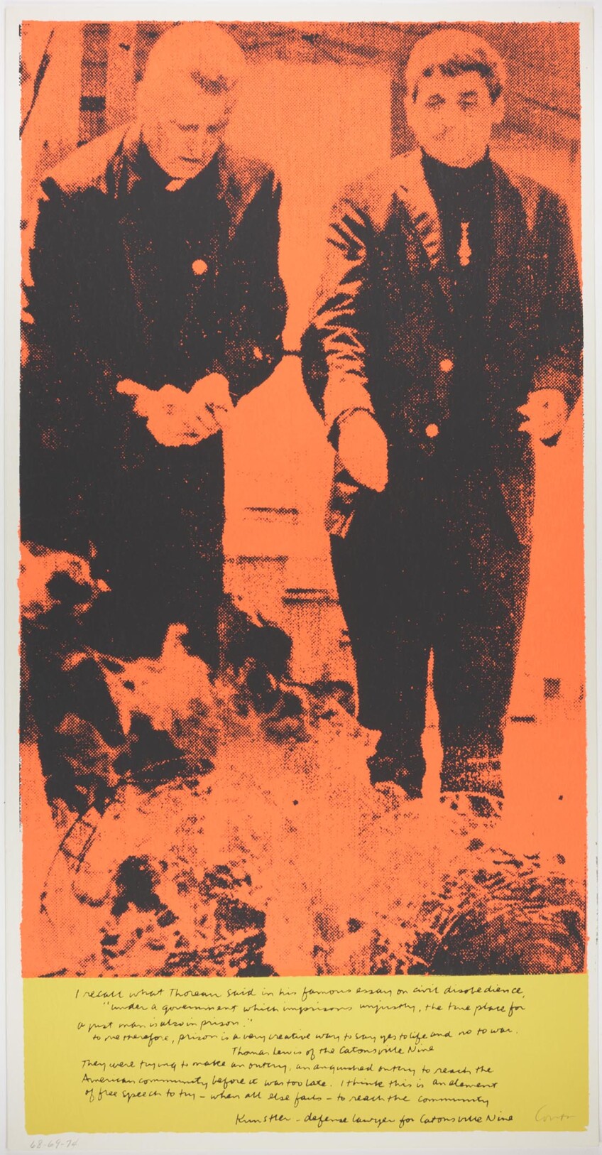
Here, viewers can see how her instructions were followed. This piece was created right after she left the order of the Immaculate Heart, she went out on her own as an artist. At this time, Kent becomes even more vocal and transitions from being just politically interested into more of a political activist, says Burglingham.
Untitled [Preparatory layout for manflowers], 1968
![Untitled [Preparatory layout for manflowers], 1968 | Collection UCLA Grunwald Center for the Graphic Arts, Hammer Museum. Corita Kent Bequest.](https://kcet.brightspotcdn.com/dims4/default/97851bb/2147483647/strip/true/crop/1100x692+0+0/resize/848x533!/quality/90/?url=http%3A%2F%2Fkcet-brightspot.s3.us-east-1.amazonaws.com%2Flegacy%2Fsites%2Fkl%2Ffiles%2Fthumbnails%2Fimage%2F17_untitled-layout-manflowers.jpg)
Kent did several silkscreens based on this image. This is the actual ink drawing, which she tore out from a magazine or a primary text.
manflowers, 1969
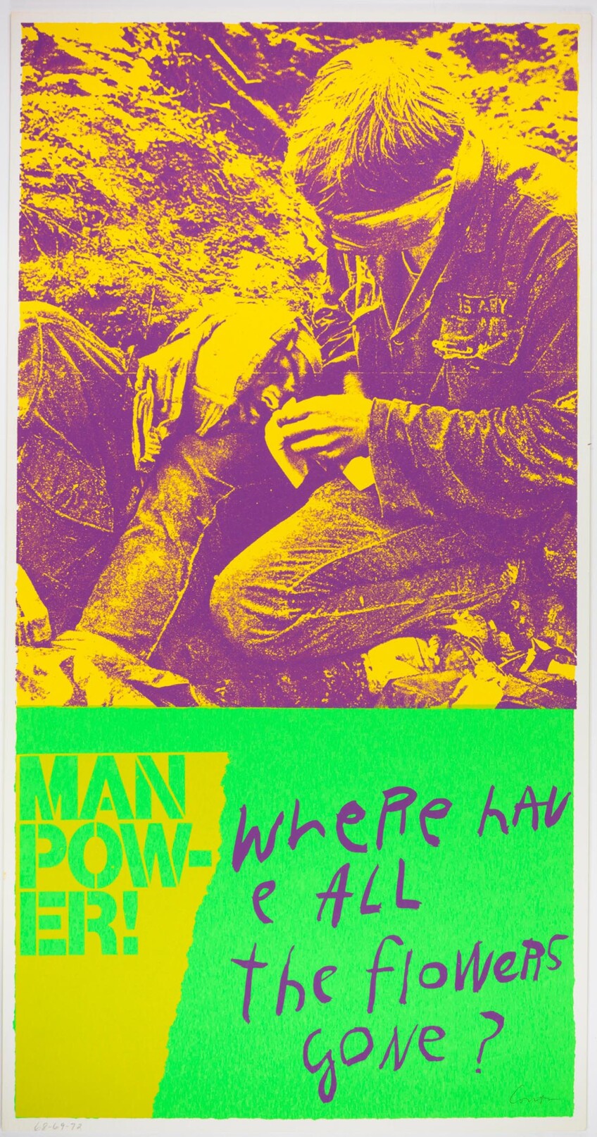
Starting from the preparatory material above, Kent created a fluorescent print, popular during the late 60s. Viewers can see a change in the layout and addition of other images as the raw material coalesces into a final print.
my country, 1981

“That kind of says it all, doesn’t it?” asks Burlingham. “She always had an incredible moral compass. She was consistently shining a light on what was wrong in the world and what needed to be made right.” Decades after it was created, it still rings true for millions living in the America of today.
Top Image: december 25, 1965 | Collection UCLA Grunwald Center for the Graphic Arts, Hammer Museum. Corita Kent Bequest.

