Eclectic Revisited: Preserving Venice's Architectural Context
It's a sunny spring morning in Venice, CA. At 10 a.m. there's no lingering marine cover, and the sky is such a bright blue it makes you blush to think of gray climes just emerging from winter. Cars fill the Westminster Avenue Elementary School parking lot, and visitors arriving for a Los Angeles Conservancy walking tour pile out, ready to hit the asphalt in sensible shoes. The self-guided tour is entitled Venice Eclectic: Modern Architecture from the '70s and '80s and part of "Curating the City Modern Architecture in L.A.," the Conservancy's ongoing contribution to Pacific Standard Time: Modern Architecture in Los Angeles.
Volunteer docents in sunhats hand out maps that list the homes, artist studios, and commercial structures designed by some of L.A.'s most important architects: Frank Gehry, Steven Ehrlich, Frank Israel, Morphosis, and Fred Fisher. The tour's draw is to get inside spaces usually off-limits to the public; its mission, however, is more profound. The Conservancy is building a case to preserve projects -- "resources," in preservation parlance -- that, let's face it, look pretty funky when compared to the kinds of contemporary architectural tastes put forth in Dwell magazine.
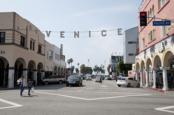
Founded in 1978, just around the time many of the tour's eclectic buildings were beginning to take shape, the nonprofit Los Angeles Conservancy is a longtime advocate for the preservation of historic L.A. structures. Community-based, with some 6,000 members, the Conservancy's efforts have saved a number of the city's most treasured 20th Century icons: the Art Deco Wiltern Theater, the space-age Cinerama Dome, and the Mayan-inspired Ennis House. The architecture and art sites open to the public through the Venice tour are, in the Conservancy's words, "the next frontier in historic preservation."
The tour was curated by Trudi Sandmeier, director of Graduate Programs in Heritage Conservation and associate professor at the University of Southern California. She stresses the need to cultivate awareness among a larger public well in advance of the fight for preservation. "So often we struggle to identify what's important after a site is already threatened," says Sandmeier. "We are already fighting to save lots of resources from the 60s. The 70s and 80s are next. It is only a matter of time." It's amazing to think now that some of L.A.'s most visible mid-century buildings would ever be at risk, but it was less than a decade ago that the Capitol Records Tower, built in 1956, was declared a City of Los Angeles Historic-Cultural Monument.
In Venice, Sandmeier wanted to tell the story of a whole neighborhood, not just emphasize the architectural merits of any one structure, and in doing so build a history of architects and artists working together. "Buildings are important for different reasons. Sometimes it's the architecture, sometimes it is the history, and sometimes it is the context," she explains. "Venice is a place with such rich cultural context that underlies the whole community, there is a lot to talk about."
Indeed, by the 1970s Venice of America founder Abbot Kinney's turn-of-the-century vision of an Italianate playland filled with canals and rollercoasters had given way to a grittier reality. The area's decline, according to the handy history put together by the Conservancy, began with the Depression and was accelerated by the discovery of oil in the area, which lead to the proliferation of landscape-deadening derricks. The cute summer bungalows and colonnaded bathhouses of earlier decades fell into disrepair. In his 1989 novel, "Hollywood," Charles Bukowski portrayed Venice as a dark and dangerous, a place rife with racial tension, a place where he was afraid to park his car for fear the tires would be stolen. Yet it is also the environment that gave birth to skateboard culture and the incongruously named art and lifestyle magazine Wet: The Magazine of Gourmet Bathing.
And it's in this blighted condition that parallel developments took place: the impoverished neighborhood took on the ugly moniker "Ghetto-by-the-Sea," and rundown buildings became home to beatniks, hippies, and artists, all lured westward by faded glamor and cheap land.
"The economics of the place allowed certain things to happen," said architect Frederick Fisher as part of a panel discussion held later on the day of the walking tour. Fisher and fellow architects Steven Ehrlich and Brian Murphy, moderated by architectural historian Daniel Paul, reflected on the creative energies and low rents that shaped Venice. "We were building a subculture. People without a lot of means could live here," Fisher continued. "That meant that young people, creative people, could play with architecture, which is not usually a discipline that one usually thinks of playing with. Architecture is a big, expensive outing. Artists are the great, unsung urban redevelopment forces. Artists were the first ones to figure out an interesting place that has good spaces, amenities, and a quality of life that's dirt cheap. They are usually the ones who are out there finding the places first and designers, architects, food, and culture follow them. Eventually, Venice becomes what it is today."
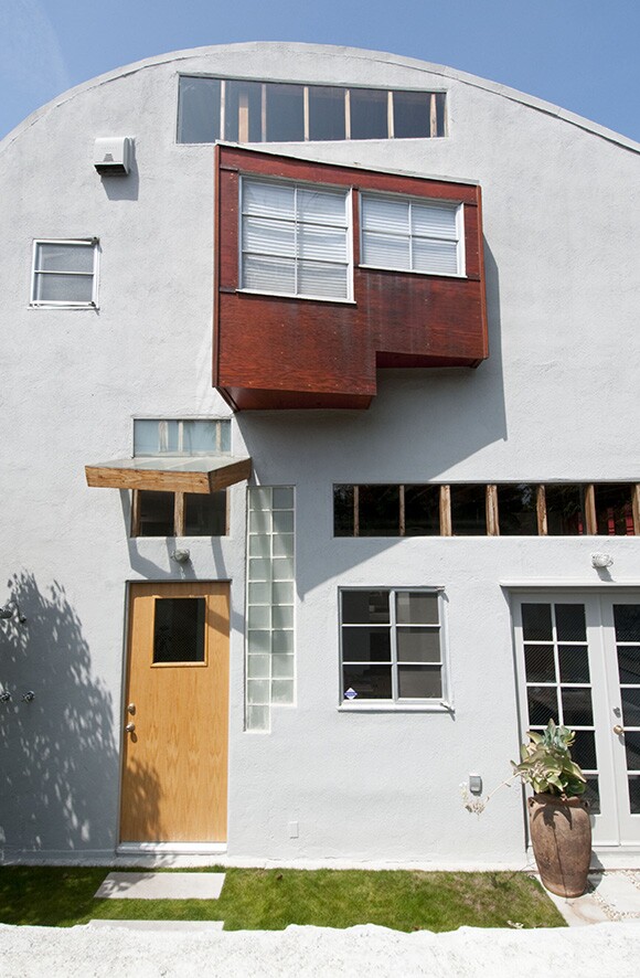
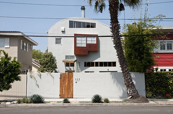
Fisher is one of the most prolific architects practicing in L.A., building residences and schools and designing exhibitions and urban plans with his firm, Frederick Fisher and Partners. But his beginnings on the West Side were humble by comparison. His Caplin House, located at 229 San Juan Ave., was a stop on the Conservancy's tour, but not open to the public. Constructed in 1979, the house is Fisher's first independent commission and, in the young architect's typical moonlighting fashion, was built while he was working in Frank Gehry's office. Standing in front of the house 34 years later, the façade still bears the hallmarks of innovation. It's a playful collage of elements: stucco, 2x4s, and a brightly painted plywood bay window jauntily sticking out from the wall. For those looking to see more of the Caplin residence, two models of its façade that Fisher made in 1978 are included in another Pacific Standard Time offering: "A Confederacy of Heretics," currently on view in SCI-Arc's gallery downtown, a world away from Venice's beachy breezes.
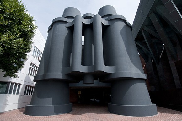
Traveling just a few blocks and a couple of years in time, Venice Eclectic included the Indiana Avenue Houses/Arnoldi Triplex by Frank Gehry, which the architect developed in partnership with artists Laddie Dill and Chuck Arnoldi. Constructed on a long, narrow lot in 1981 (and rumored to have cost a mere $15,000 at the time), the three live-work studios were speculative in both real estate and design. Gehry treated the studios as an exercise in materiality and form. Each one was addressed sculpturally, drawing meaning from banal domestic objects: a stair, a chimney, a bay window. But just as Claes Oldenberg (whose giant binoculars would later adorn a Gehry building in the neighborhood) plays with scale and makes jumbo versions of everyday life, Gehry transforms his objects into oversized, inhabitable spaces. Each is covered with a different exterior cladding: green asphalt shingles, plywood, stucco. Gehry's sleight-of-hand is to turn off-the-shelf materials into abstract forms.
"I always admired Frank because he did his most speculative work at that moment when the economy was down," recalls Fisher. "He said: 'I don't have any work anyway, so I'm going to the most crazy stuff possible.' The established profession was outraged. People thought he was destroying architecture. He was using these low-grade materials in this temporary, ad hoc way."
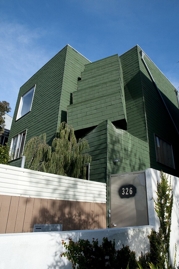
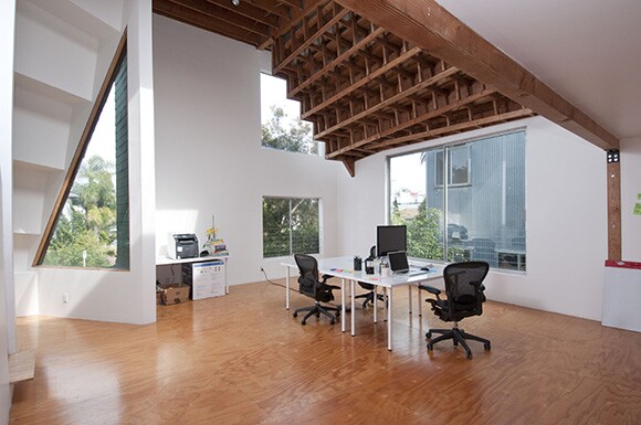
The front condo -- green shingles over a stepped façade -- was open to visitors on the day of the tour. Inside, the 1,500-square-foot space is modest: The ground floor hosts living and dining areas and the upstairs an airy work loft. It's here that Gehry's gestures take on new life and one can see beginnings of what's become his signature work. The steps on the outside erode the corner of the room, where previously hidden windows look out over the street. A latticework of timber framing echoes the stair motif but effortlessly combines the rigor of Sol Lewitt's gridded sculptures with the opulent, honeycombed details of sacred architecture. The effect is uncanny, a radical departure from L.A.'s modernist traditions.
Next to the Arnoldi Triplex is the Hopper House, Brian Murphy's 1989 addition to the block. Designed for the actor/filmmaker/artist Dennis Hopper, the house presents Venice with a wry, mixed message. A front yard edged in a white picket fence gives way to a windowless, corrugated metal façade. It's both home and compound -- or, in Murphy's terms, "paramilitary suburban." Murphy's an architect who earned an edgy reputation for what some called "white trash modernism." During the panel discussion, he described how the Hopper residence responds to its neighbors: "I was very sensitive to the fact that Gehry had these condos next door. There were three follies: stucco, shingles, and plywood. And I'm a big fan of Marxist pastiche, so I thought: What's the next material in that litany? And it seemed to be tin."
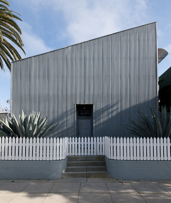
Behind the home's austere exterior is a warehouse-like space fine-tuned to Hopper's passions and peccadillos: a living/lounging area that doubles as a screening room and performance space, white walls for his art collection, and an enclosed motorcycle parking area. Over the years Hopper acquired the adjacent properties, adding the Arnoldi Triplex and a small bungalow to his compound. His estate was sold and broken up after his death in 2010, so the house is no longer filled with Hopper's art. However, the new owners acquired his motorcycle from "Easy Rider," which is on view.
One of the Los Angeles Conservancy's goals is to create a constituency of people who care about preserving L.A.'s built environment. In Venice, the challenge is how to hold on to the things that make the place funky as Abbot Kinney Boulevard and Main Street fill up with chic boutiques and watering holes. "We can take as many pictures as we can, but it still isn't the same as being there," explains Sandmeier.
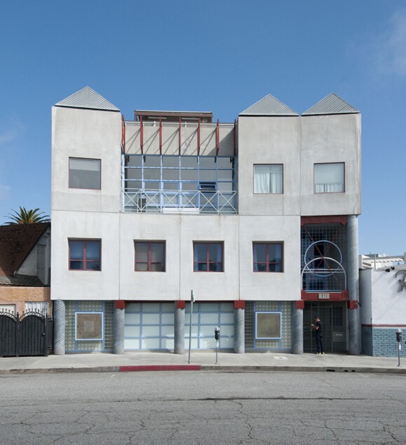
For architect Steven Ehrlich, who first opened his practice in Venice, the question of how to design for and with history inspired the three structures he built from 1986 to 1989 around Windward Circle, once the heart of Kinney's exotic development. Ehrlich's trio of mixed-use structures -- Race Through the Clouds, Ace Market Place (the former home of the influential ACE Gallery), and the Arts Building -- ring the former lagoon; each take cues from the site's history, such as dredging machines that created the canal or amusement park architecture. While the quirky edifices now bear the historical weight of their own whimsy, at a quarter-century of age Ehrlich's buildings deserve reevaluation precisely because they grapple with Venice's bygone days through design.
"I did the historical research and found out that there were three different structures on each property: the Race Through the Clouds rollercoaster, the Antlers Hotel, and the Venice Bathhouse," explained Ehrlich during the panel discussion. And the architect's remarks about his architecture unwittingly summed up the importance of the conservation Los Angeles' urban fabric. "It was very much an exercise in looking into the past having it influence the present. And now that present is already old."
Dig this story? Sign up for our newsletter to get unique arts & culture stories and videos from across Southern California in your inbox. Also, follow Artbound on Facebook and Twitter.
Top Image: Binoculars Building | Photo: Larry Underhill.