How Was Taxpayer Money Spent? L.A. Politician Makes Infographic

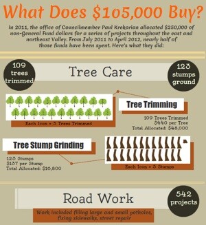
Before Jeremy Oberstein was a communications guy for L.A. City Councilman Paul Krekorian, he was a reporter (disclosure: he volunteered for me at my last publication). It looks like he's keeping up on trends in new media reporting these days. Today his office released an infographic about how his boss is spending a portion of the budget for its San Fernando Valley district.
The information hasn't been verified by KCET, but it was interesting to see a local L.A. politician use this type of visual design to communicate with constituents. It's not a first for City Hall -- the departments of transportation and planning have combined forces with GOOD magazine for some infographics -- but this trend seems to be picking up steam. So I asked Oberstein to talk about the project.
"We make regular use of a wide arrange of tools to explain how Councilmember Paul Krekorian is providing a high level of constituent service. Upon taking office, you may recall, we created a new website from scratch and included a section of Google maps with data we culled from various city departments. The earliest map was a list of streets that had been repaved in FY2009-10 and explained to residents -- in clear, visual terms (read: not a .pdf)0 -- exactly what service their council office provided. This graph is a continuation of that trend.
"This follows a long running ethos of the Councilman to create an easily accessible, easy to understand chart of how these funds were spent, distilled into distinct sections. This chart is a narrative of the work city crews have done over a period of time and how tax dollars are spent to improve our neighborhoods."
He said the office came up with the idea a couple of days ago using Piktochart and that it cost no money, save for the time staff time. It can be seen in full below: